Working with a 5th Black Spot Color Plate in Page Makeup
Working with a 5th Black Spot Color
What is it and Why is it Used?
In the fairly niche world of publishing, the process of writing, researching, editing, designing, proofreading and illustrating a book are tasks rarely all performed in house. In the larger publishing houses there are usually resident editors and managing designers who outsource work to very small, often one-man-band outfits.
One of my first jobs in graphic design was to do page pakeup for educational books, usually destined for foreign markets. Our studio worked for a number of publishing houses, and most of them required a 5th black spot color plate be used for all text in the publication. It took a while for me to understand what all this meant (it's amazing what is not automatically explained to you in a design studio - you have to ask about anything and everything to learn the ropes) - but it's really quite simple once you understand the whys and wherefores.
A fifth color is any spot (solid) color ink used in addition to the four color CMYK mix (Cyan, Magenta, Yellow and Black/Keyline). Usually the four color process printing is carried out (one plate at a time) and then the final fifth color is added.
A fifth color might be used for a number of reasons - perhaps because a metallic Pantone color needs to be applied to a project. Or maybe a catalogue is being distributed to numerous dealers, each one of which needs a different address printed on the back.
Publishers use a fifth color for text (usually referred to as 5th black or text black) if their books are going to be distributed to a number of different countries, each requiring a different language in the body text. The print runs of these books are so vast that it is more cost effective for all the text to be 'overprinted'. This means that the books are printed using the CMYK color process, but excluding all the text.
The books are then overprinted with an additional 5th black plate which contains whatever language is appropriate for that print run. So you'll end up with books going to Spain and Germany which are identical except for the fifth black spot color overprint containing either the German or Spanish text.
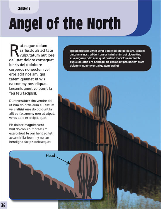
Below is a rough and ready demonstration of a typical page design on which the text is assigned a 5th black spot color and the rest of the page is CMYK:

Here is the same page with the additional black color plate 'hidden' by toggling off the 5th black color in the Separations Preview palette in InDesign. As you'll see, the CMYK black still prints and is visible in the images and other graphics, The 5th black plate is also 100% black, but is treated as a spot color 'overprint', enabling anything colored with it to appear on a fifth color plate. The white box over the image (with rounded corners) is explained further down this page.

The economies of scale created by this method of working might benefit the publisher, but it also presents them (and in particular the designers and authors) with a special set of limitations and potential pitfalls. Such issues are as follows:
Issue 1 - Language and 'White' Space
Every language has different words for different things. An obvious observation, I know. The reason I mention it is that authors and translators have to make sure that the text to be overprinted in 5th black takes up exactly the same amount of space as the text for every other language. This is because the design of the layout leaves certain set areas for text which cannot be increased or reduced in size without reprinting the book. When you consider that the German for 'biro' is 'kugelschreiber' you'll begin to see the potential problems!
This means that when creating caption boxes or text panels, in English editions you might notice that there's a lot of 'white' (clear) space around the text. This is so that other languages can say the same thing and also fit in the same space. The original design needs to take this issue into account.
Issue 2 - Overprinting and Knocking Out
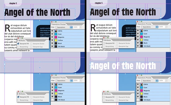
It's essential that the fifth black plate is set to overprint, not knockout. If the text is set to overprint, the CMYK part of the design will print out completely devoid of any 5th black plate markings. If the swatch is set to knockout, the CMYK design will show white text wherever the fifth color plate overlays any part of the design.
For example, below I have opened a file in InDesign CS2, set the preview to Overprint Preview (VIEW/OVERPRINT PREVIEW) and opened the Attributes Palette. With the header text selected, on the left I checked the Overprint Fill box. I then opened the Separations Preview palette and 'hid' the fifth black plate. The text obediently disappeared. I did the same on the right, but unchecked the Overprint Fill box. This time, when the plate was hidden (by toggling the eye to the left of the ink name in the Separations Preview palette) the text color 'knocked out' the ink behind it, leaving apparently white text. Obviously we don't want this happening when the book goes to press.

Issue 3 - Color
All the text needs to be colored with the 5th black. This means that there can be no colored text unless it knocks out a block of 5th black and adopts the color beneath. For example, below are two different treatments of a typical caption box.
In the version below, the caption text seems to be colored white. This is not the case. The text is actually 1% 5th black, set to overprint and laid over a 100% 5th black box, also set to overprint. Beneath the caption box is another box of identical size and position, coloured white. The text on top inherits the white of the box at the back.
The drawback of using this method is that the white box appears on the CMYK version of the book (as shown above in the second image on this page). If this happens you need to be certain that you've given the box enough space for all possible translations, because the size of the box itself cannot be increased or reduced in size without an ugly white (mismatched) box appearing underneath.

In the second version below, the white box has been deleted and the text has inherited the color of whatever artwork or image is behind it. The text is still 1% 5th black, set to overprint and laid over a 100% 5th black box, also set to overprint. The drawback here is that whatever color is behind has to be plain enough and light enough to make the text legible. The benefit of using this method is that the entire panel disappears when the additional color plate is hidden, which means that other translations can adjust the caption box size as required.

Issue 4 - Importing Artwork
When importing illustrations from a program like Adobe Illustrator, labels are often included in the artwork. This text and annotation (and usually leader lines) also need to be colored in the same fifth black plate in Illustrator as in InDesign (or Quark XPress). Not only that, but the 5th black swatch has to have EXACTLY the same name as the swatch in InDesign or Quark. If even it's spelled the same but the character case is different, the swatch will import as an additional color plate in InDesign, and you'll end up with six colors instead of five.
Also, the Overprint Stroke and Overprint Fill check boxes need to be ticked in the Illustrator Attributes palette to prevent knockout:

If this artwork has been prepared correctly the annotation will disappear when you toggle the additional black plate on and off in InDesign or Adobe Acrobat (whilst in Overprint Preview). If the text is not set to overprint it will turn white when you toggle off the color using the Separations Preview Palette. If it's normal CMYK black (or has any of the other CMYK colors mixed in) it will print along with the other CMYK colors and you'll be stuck with the wrong language in a foreign edition. This is why it's important to check, double-check and check again,
This is a brief overview of how to work with a fifth black plate - if it doesn't answer your question or is ambiguous in some way, please let us know through our feedback form and we'll always endeavour to clarify the article accordingly.
Resources & More Information
- Photoshop Clipping Paths
- Free Method of Converting Quark to InDesign
- 4 Color Process Printing and Spot Color Printing - What's the Difference?
- Return from 5th Black Spot Color Plate to Home