Over Printing Problems in Quark and InDesign - and How to Solve Them
What do Over Printing Problems Look Like?
Have you ever sent artwork to press that looks perfect on-screen, but dreadful in print? For example, when areas of solid black allow images behind to show through? This happened to me a couple of times before I got to the bottom of the problem. The overprint settings need to be set correctly before going to press, which is why modern page layout programs such as InDesign and pre-press programs like Acrobat have built-in PDF Overprint Preview options. These allow you to spot potential over printing problems before they become expensive! Here I'll simulate a few common over printing problems and explain how to avoid them.
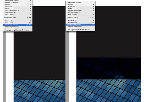
The above example shows an A4 document created in Quark XPress 6. All settings were default. I placed a CMYK image in the background, and then placed a 100% black box over the top of the image. The image behind ended halfway up the page. I then exported the file as a PDF file. If you do the same and open the PDF file in Acrobat (I used version 6 for this example), the artwork (above left) will look normal and as expected when "Overprint Preview" is turned off. (This setting can be found under Advanced/Overprint Preview.)
Turn the Acrobat Overprint Preview setting on, and you'll see the simulated print result (above right). As you can see, the image shows through the black block because the default Quark setting for black is 'overprint'. This means that the Cyan, Magenta and Yellow plates are printed first, and then the Black plate is "overprinted" on top, allowing other inks to show through. The Acrobat Overprint Preview setting is an invaluable tool because it simulates what will happen in print to the artwork you are viewing.
How do I fix this over printing problem in Quark XPress?
There are a number of things you can do to fix this issue.
1 - Change the trap settings
First, you could change the "Trap" settings in the color palette. Open the color palette (see below). Select Black and click Edit Trap. Select all colors in the list, click on the Trap dropdown menu and select "Knockout". This will ensure that the black literally "knocks out" the other colors wherever it appears. So wherever 100% black appears, a white space will appear on the other plates, making sure that the black will only have white (or the color of the stock) behind it and no other inks.
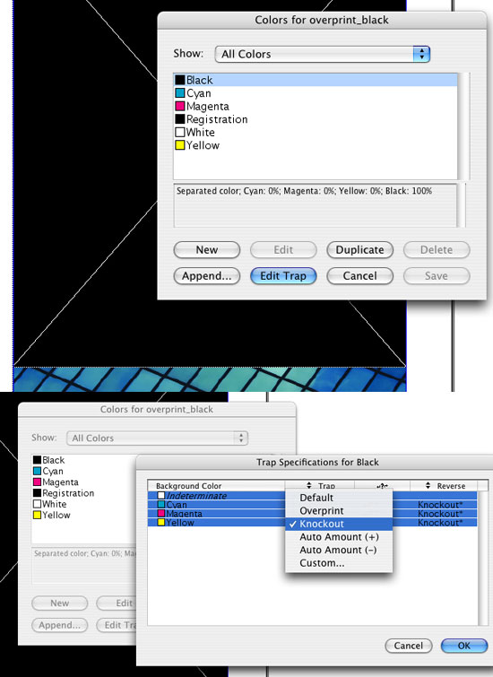
Of course, if you go down this route, you have to be confident in your print supplier - if the registration is even slightly out you'll end up with nasty white lines all over the place...
2 - Snap the objects to guides
To avoid over printing pitfalls, probably a safer thing to do would be to make sure that the objects don't overlap in the first place. Drag a guide to, say, 215mm on the Y axis (I always prefer nice round numbers!). Make sure Snap to Guides is enabled (View/Snap to Guides). Snap the bottom of the black box to the guide, and then the top of the image box:
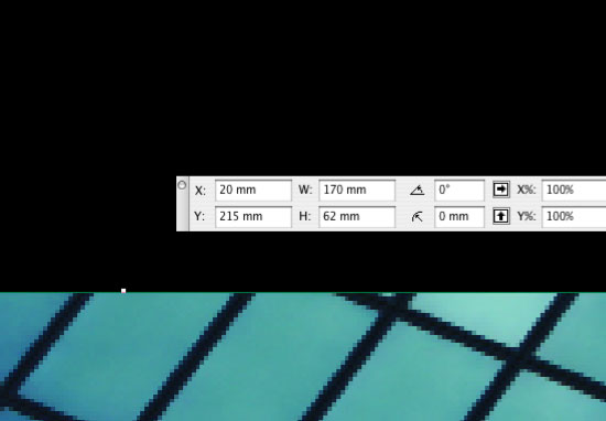
That's it! The black won't print over the image because the image is no longer beneath it. If you go down this route, the black swatch is still set to overprint, which is what all instances of 100% black will do - text or otherwise. It's usually fine for black text to overprint because it's very difficult to tell if there's any show-through unless it's a very large, blocky type face.
3 - Use rich black instead of 100% black
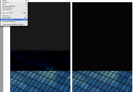
Rich black is basically a darker black made out of the CMYK mix rather than just 100% black. If you look at the first image in this article you'll see that where the 100% black overlaps an image it becomes much darker. This is because on the face of it the image is 'showing through'. In reality of course, it's because the inks that made up the image have mixed themselves with the black to make it darker. This has created a accidental, multi-tonal 'rich black'.
Something else that's highlighted here is the fact that 100% black suddenly looks rather gray next to other colors. This is way I always use a rich black for areas of solid black. The introduction of other inks into the black will also stop the default over printing in Quark. Below is an image showing the overprinting 100% K (black) on the left and our rich black alternative on the right:
So how do I create rich black?
Rich black is set up in your color (or swatch) palette just like any other color. Different studios have different CMYK value mixes for different purposes. The safest bet would be to ask your printers what rich black mix they would prefer. It's best to avoid too heavy a saturation of color, and a generally accepted rule of thumb is to keep the total percentage of ink below 280% (out of a possible 400%) because excess ink delays drying time and can create offsetting problems.
However... I have always been guided by Photoshop when it comes to using rich black. If you open Photoshop and press "D" (or click on the "Default Foreground and Background Colors" in the toolbar; see below), the foreground and background colors will default to black and white. Click on the foreground black.
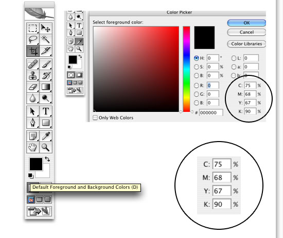
If you thought that the default Photoshop black was 100% K, you were mistaken - the values are C75% M68% Y67% K90% - a nice rich black. These are the values my studio has always used, to great effect. The total value comes to 300%; somewhat over the recommended mix, but it's never given us any trouble. Our text, however, remains 100% black. The rich black is just for blocks of black and graphics.
Other popular rich black CMYK values are:
- 40%C 0%M 0%Y 100%K
- 30%C 20%M 20%Y 100%K
- 60%C 40%M 40%Y 100%K

How do I fix over printing problems in InDesign?
The principles are the same in InDesign as in Quark XPress. You can avoid overlaps in the same way, turn off overprinting of black (as demonstrated below) or create a new rich black swatch. It's up to you!
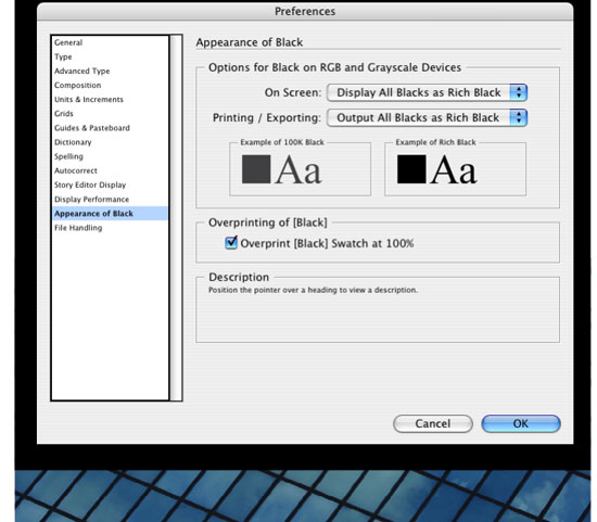
InDesign CS2 has a built-in overprint preview (and separations preview) window so you can check your artwork before it goes to PDF. However (there's always a 'however'!) you might want to turn off the "Display All Blacks as Rich Black" settings under InDesign/Preferences/General/Appearance of Black before using the built-in overprint preview. Otherwise the results can be misleading. You'll also find an option to turn off black over printing in the same preferences window. Handy! Almost as if it was created with designers in mind...
Don't forget over printing settings in Illustrator!
Oh yes... Illustrator. If you import an Adobe Illustrator file containing vector information, don't forget to make sure the over printing settings are consistent with the document you're bringing it into. Overprint stroke and fill settings can be found in the Attributes Palette of Illustrator (Windows/Attributes).
The bottom line here is this: always, always check and double check your press-ready artwork in Acrobat before sending it to press. It's a great tool.
Resources & More Information
- Photoshop Clipping Paths
- Free Method of Converting Quark to InDesign
- 4 Color Process Printing and Spot Color Printing - What's the Difference?
- Return from Over Printing Problems to Home